
Fun playlist covers are custom artwork designed to express the exact mood, theme, or energy of a curated music mix. They transform standard digital albums into personalized visual experiences using bold graphics, retro photos, quirky doodles, and humorous captions. Creating unique covers helps organize your library while showcasing your personal taste.
Music streaming has transformed how we experience audio, but visual identity still matters. Custom artwork turns a plain list of tracks into an aesthetic experience.
Learning to make fun playlist covers lets you express your personality and give your favorite tracks a unique visual identity. A vibrant cover sets the exact mood before anyone presses play.
Whether you want aesthetic retro collage designs or meme-inspired graphics, creating visual covers gives your music collections character. Let us explore how you can craft memorable album art for every mix.
What Makes Fun Playlist Covers So Popular Today?
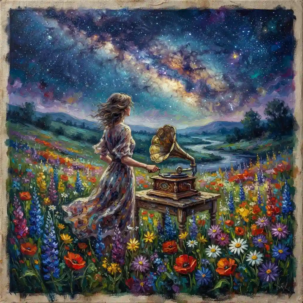
Visual cues change how we listen to audio. When you pair dynamic visuals with curated tracks, the entire collection feels more like an intentional art project than a simple list of songs.
People share their music constantly on social platforms. A customized cover acts as a visual preview of your personal taste, mood, and current aesthetic preferences.
Expressing Personal Aesthetics
Your favorite songs tell a personal story. Designing fun playlist covers allows you to showcase your design taste alongside your audio preferences.
Custom graphics make your digital library feel personal. Browsing through colorful artwork makes organizing your digital audio collections far more satisfying.
Setting the Right Listening Vibe
The right image immediately communicates what a listener should expect. Bright neon colors signal high energy, while soft pastel hues suggest relaxed acoustic tracks.
Visual themes help your brain prepare for specific moods. Choosing colorful cover art creates an immersive experience long before the first note plays.
Improving Library Organization
Searching through hundreds of default grid covers takes extra time. Unique visual designs help you spot your workout beats or study jams instantly.
Using distinct color schemes and clear text styling keeps your music collection sorted. Visual recognition saves time when you need to pick music quickly.
Creative Styles for Modern Playlist Covers
Different genres and listening sessions require distinct visual approaches. Selecting an aesthetic theme guides your entire design process from colors to typography.
Mixing artistic influences creates standout covers. Combining photography with hand-drawn elements adds personality to any track collection.
Retro and Nostalgic Aesthetic
Nostalgic graphics rely on vintage imagery, film grain texture, and retro color palettes. Using warm analog filters gives your music artwork a classic, cozy feel.
Film borders and cassette graphic overlays work remarkably well for indie mixes. Retro styling creates a sense of comfort and timeless musical charm.
Minimalist Graphic Layouts
Minimalism relies on clean typography, single focal points, and deliberate space. High contrast between text and solid backgrounds creates bold, modern visuals.
A simple symbol paired with a crisp sans-serif font makes a strong statement. Minimalist design ensures your cover looks clean even on smaller smartphone screens.
Meme and Humorous Imagery
Humorous artwork makes listening fun. Using ironic photos, funny reaction pictures, or unexpected absurd graphics creates an instantly memorable visual identity.
Memes work exceptionally well for casual summer mixes, party jams, or daily commute tracks. A playful image brings a lighthearted atmosphere to your music stream.
Collage and Mixed Media Art
Collage art blends cut-out imagery, magazine clips, and textured overlays into a single layout. Combining contrasting visual elements creates layered, expressive art.
Mixed media designs work great for eclectic mixes with diverse musical genres. Blending disparate elements visually mirrors the diverse song selection within your collection.
Essential Design Tools for Custom Album Artwork
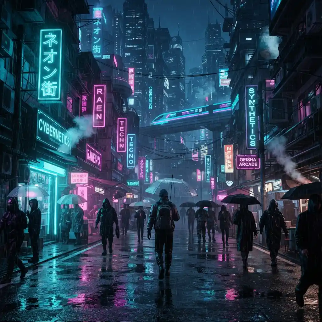
Creating high-quality artwork does not require professional graphic design experience. Accessible digital tools make building visual content quick and simple.
Choosing the right platform depends on your preferred workflow. Mobile editing apps offer quick solutions, while desktop platforms provide detailed customization tools.
Free Online Graphic Editors
Web-based platforms like Canva provide template options sized specifically for streaming covers. Drag-and-drop elements let you place text, shapes, and photos easily.
These platforms feature extensive graphic libraries filled with free fonts and icons. Beginners can build polished visuals without learning complex editing software.
Mobile Photo Editing Apps
Editing applications like VSCO, Picsart, and Lightroom Mobile allow on-the-go creative control. You can adjust colors, apply grain textures, and edit photos directly on your phone.
Mobile editors make it easy to snap a photo and convert it into a cover immediately. Quick touch-ups keep your design workflow seamless and enjoyable.
Stock Photo and Vector Resources
High-quality graphics require clear base images. Platforms like Unsplash and Pexels provide free high-resolution photos perfect for cover background imagery.
Using royalty-free assets prevents pixelated, low-resolution graphics. Crisp base images elevate the overall presentation of your custom visual artwork.
Step-by-Step Guide to Crafting Fun Playlist Covers
Building great cover art follows a structured creative path. Planning your layout ensures your final cover balances visual appeal with clear text readability.
Follow this simple framework to convert your creative ideas into finished cover art.
Step 1: Define the Theme and Energy
Identify the primary emotion of your song collection before starting your design work. Ask yourself if the tracks feel energetic, reflective, chaotic, or calming.
Select colors and imagery that match that specific mood. Clear conceptual focus prevents your cover design from feeling cluttered or disjointed.
Step 2: Choose Your Base Image
Select a clean image that serves as your central visual anchor. Choose high-resolution photography or bold graphics that remain clear at small sizes.
Avoid crowded images with too many competing elements. Simple, strong central subjects translate best to square cover proportions.
Step 3: Apply Filters and Visual Effects
Use color grading to unite your base image elements. Increasing contrast or applying warm vintage tones enhances the overall mood of the image.
Adding subtle grain or light leaks gives digital graphics an organic feel. Controlled effects convert plain digital photos into stylistic cover art.
Step 4: Add Clear Typography
Select fonts that match your aesthetic tone. Bold display fonts suit energetic tracks, while simple script fonts complement acoustic listening sessions.
Keep text brief and easy to read. Using short title text ensures readability even on small mobile display screens.
Color Theory Tips for Vibrant Cover Designs
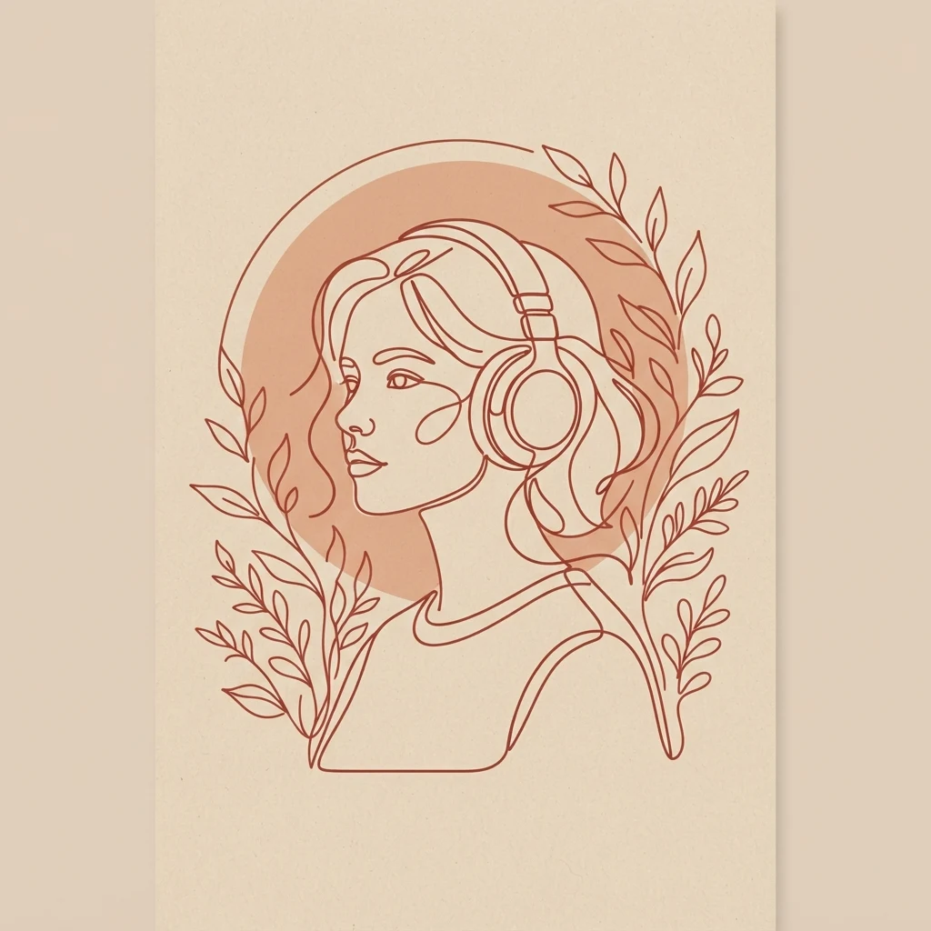
Color choices evoke strong emotional responses. Understanding basic color pairing helps you craft fun playlist covers that capture reader attention instantly.
Using strategic color contrasts ensures your visual art pops off the digital screen.
High-Contrast Color Combinations
Pairing complementary colors creates dynamic visual energy. Combining bright yellow with deep blue makes textual elements stand out clearly.
High contrast improves visibility across dark mode and light mode streaming interfaces. Bright elements draw immediate attention on crowded digital platforms.
Monochromatic and Pastel Palettes
Monochromatic color schemes use different shades of a single color. This approach produces a unified, cohesive appearance ideal for ambient or focus mixes.
Pastel palettes create soft, calming visuals. Gentle pinks, mint greens, and soft blues suit relaxed acoustic audio collections.
Typography Best Practices for Playlist Art
Text placement transforms a good background photo into a functional cover design. Clear fonts help viewers identify your mix theme without effort.
Balancing font styles preserves both aesthetics and basic legibility.
Keeping Text Legible at Small Sizes
Streaming platforms display cover images as tiny thumbnails on mobile screens. Small fonts and delicate line weights become unreadable at reduced scales.
Use thick letterforms and strong contrast between text and background. Test your layout by zooming out to thumbnail size before exporting.
Matching Font Styles to Music Genres
Typography communicates genre instantly. Industrial sans-serif fonts fit electronic music, while classic serif fonts fit classical or jazz collections.
Avoid using decorative script fonts for long titles. Simple, intentional font selection keeps your overall design clean and professional.
Avoiding Common Playlist Cover Design Mistakes
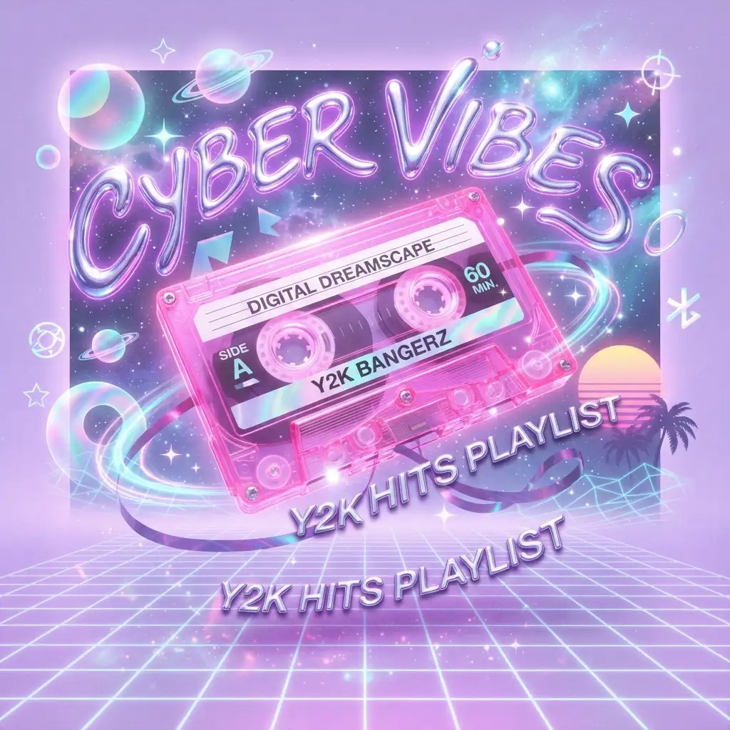
Small design errors can ruin an otherwise great creative concept. Avoiding typical layout pitfalls ensures your finished cover looks polished.
Simple corrections elevate your visual artwork from amateur to professional grade.
Overcrowding the Square Canvas
Adding too many elements creates visual confusion. Overloading your cover with stickers, text, and graphics makes the central focal point unclear.
Embrace negative space in your design layouts. Giving visual elements room to breathe creates a cleaner aesthetic balance.
Low-Resolution Image Distortion
Using low-resolution base images leads to pixelated, blurry covers when rendered digitally. Always start with crisp, high-quality media files.
Design your canvas at 1000 by 1000 pixels minimum. Higher resolutions ensure your artwork stays sharp across all device screen sizes.
MCQs
Test your knowledge on designing vibrant, functional covers with these ten quick practice questions.
1. What is the main purpose of a playlist cover?
A) To show the playlist’s theme
B) To increase phone storage
C) To change the song length
D) To adjust the volume
2. Which design element can make a playlist cover look more colorful?
A) Bright colors
B) Blank space only
C) Tiny text
D) No images
3. Which cover would best suit a relaxing music playlist?
A) Calm sunset
B) Racing cars
C) Exploding fireworks
D) Busy traffic
4. What type of image might fit a workout playlist?
A) Running shoes
B) Sleeping cat
C) Cup of tea
D) Quiet library
5. Which font style can give a playlist cover a playful appearance?
A) Fun and bold lettering
B) Invisible text
C) Extremely tiny text
D) Random symbols only
6. Which theme would work well for a summer playlist?
A) Beach and sunshine
B) Snowy mountains
C) Dark winter forest
D) Rainy streets
7. What could make a playlist cover feel more personalized?
A) A unique illustration
B) An empty background
C) Unrelated text
D) A random file name
8. Which color combination could create a cheerful playlist cover?
A) Yellow and pink
B) Gray and black only
C) White only
D) Transparent only
9. What kind of cover would fit a road-trip playlist?
A) Open road and car
B) Office desk
C) Kitchen sink
D) School notebook
Answers
- A) To show the playlist’s theme
- A) Bright colors
- A) Calm sunset
- A) Running shoes
- A) Fun and bold lettering
- A) Beach and sunshine
- A) A unique illustration
- A) Yellow and pink
- A) Open road and car
FAQs
What size should my cover image be?
Your cover image should be a perfect square, ideally 1000 by 1000 pixels in size. Using standard square dimensions ensures your artwork renders without awkward cropping or distortion across major music streaming platforms and mobile devices.
Can I use copyright-protected photos on my private mix covers?
Using copyrighted images for personal, non-commercial mix covers is generally fine for private libraries. However, if you plan to share your mix publicly or build a public brand, stick to royalty-free stock imagery or original photos to avoid copyright issues.
What free software is best for building mix art?
Canva is one of the best free software options for creating mix art quickly. It offers ready-made square templates, extensive font libraries, simple drag-and-drop mechanics, and intuitive photo editing tools ideal for graphic design beginners.
How do I make my cover text readable over busy photos?
To make text readable over busy photos, apply a dark transparent overlay or subtle drop shadow behind your letters. Adding solid background shapes behind text blocks also increases contrast and keeps typography crisp against complex image backgrounds.
Should I include the title text directly on the artwork?
Including title text directly on artwork is completely optional depending on your aesthetic preference. Minimalist designs often skip text entirely, while retro or meme covers rely heavily on bold text overlays to communicate the mix theme instantly.
Why does my uploaded cover image look blurry?
Your uploaded cover image likely looks blurry due to low source resolution or heavy image compression during upload. Always design artwork using high-resolution base files with minimum dimensions of 1000 by 1000 pixels to maintain sharp visuals.
Can I change my cover art after publishing a mix?
Yes, you can update your cover art anytime through your music app settings. Simply edit your playlist details, upload a new square graphic, and save your changes to refresh your music collection visual presentation instantly.
Conclusion
Designing fun playlist covers is a rewarding way to elevate your everyday listening experience. Pairing visual creativity with curated sound turns ordinary song lists into expressive digital art projects.
Experimenting with different aesthetics like retro grain, minimalist text, or humorous imagery keeps your library fresh. Using modern design tools makes crafting custom covers fast, fun, and effortless.
Grab your favorite design tool, pick a theme, and create unique artwork for your favorite audio tracks today!

Asjad Ali is a passionate, fun, and entertainment enthusiast who enjoys discovering interesting, amusing, and engaging content from around the web. Through laughvista.com, Asjad shares lighthearted ideas, entertaining stories, fun facts, jokes, and enjoyable content designed to bring a little more laughter and positivity into everyday life. His goal is to create content that feels natural, relatable, and easy for everyone to enjoy.
With a genuine interest in fun and entertainment, Asjad Ali focuses on creating friendly content for readers of different ages and backgrounds. laughvista.com is built around the idea that a few moments of laughter can brighten anyone’s day. Whether readers are looking for something funny, interesting, or simply entertaining, Asjad aims to make every visit enjoyable, refreshing, and worth coming back to.